
Pillar CV template
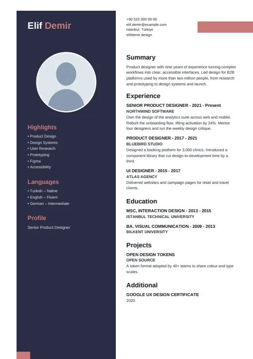
A dark pillar, set in from the page edge, carries your name, photo and skills.
- With a photo
- Two columns
- 5 colours
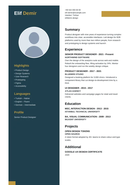
5 colours to choose from
The layout stays; only the colours change.
-
Gold
-
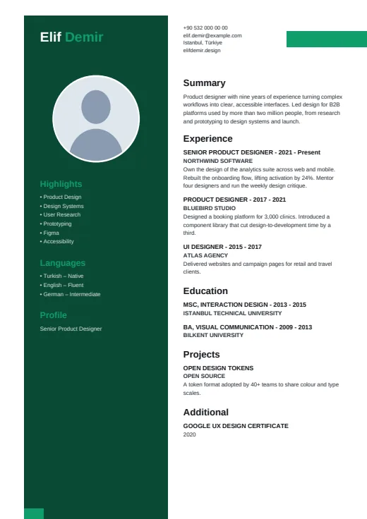 Emerald
-
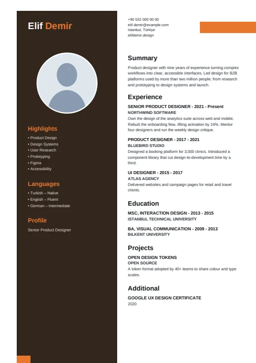 Tangerine
-
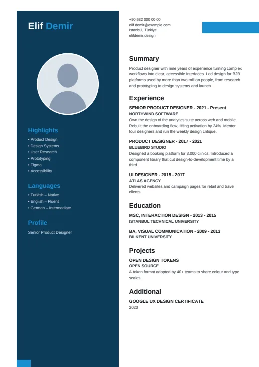 Sky
-
 Rose
What sets it apart
-
An inset pillar
The dark column doesn't touch the page edge: it starts a little way in, stops short of the top and has a small accent square at its foot. Your name heads it in white and the accent colour, above a round photo with a white ring.
-
Title under Profile
Your job title appears once, at the bottom of the pillar under the heading Profile. Twin CV takes it from your most recent position, so adding a new role updates it.
-
A quiet top right
Opposite the pillar, the page opens with your contact details as plain text, next to a small block of accent colour. The block is only decoration; your Summary starts just below.
Who it suits
- Candidates who write short, one-line achievements rather than paragraphs
- Anyone who wants name, photo and skills framed in one strong block
- Early-career applicants whose history fits a narrow column
How an ATS reads it
In the details, Pillar is easy on parsers: no letter-spaced text, no icons, skills as a plain list and language levels in words, all real, selectable text. The catch is the layout. Your name, job title, skills and languages all live in the pillar, a separate frame from the main column. Most parsers read both; some read columns out of order. Applying through a strict online portal? Send Plain ATS.
Use this design
Build your CV, then choose Pillar in the design gallery.
Start in Quick CVQuick CV needs no account; the design gallery opens once you sign up. Every plan can preview every design, and the PDF download comes with Standard and Premium.
Questions about Pillar

Which contact details does Pillar show?
Up to four, at the top of the main column, taken in this order: phone, email, AI twin link (when you switch it on in Options), address, then website, LinkedIn and GitHub. With the first four filled in, website, LinkedIn and GitHub are left out.
How should I write bullets for Pillar's narrow column?
Keep them short. Pillar's main column is the narrowest of all our designs, so one-line achievements read cleanly while long sentences wrap into tall blocks. If your bullets run long, Notch gives a similar layout a wider main column.
What does page 2 look like in Pillar?
The pillar is drawn on every page, but from page 2 it stays empty: name, photo, skills and languages appear on page 1 only. Experience and the other main sections carry on in the right-hand column, with page numbers.
More designs
-
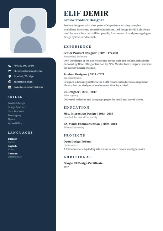 Notch
A serif CV whose dark left column opens around your photo, set in a notch near the top.
Photo · Two columns · 5 colours
-
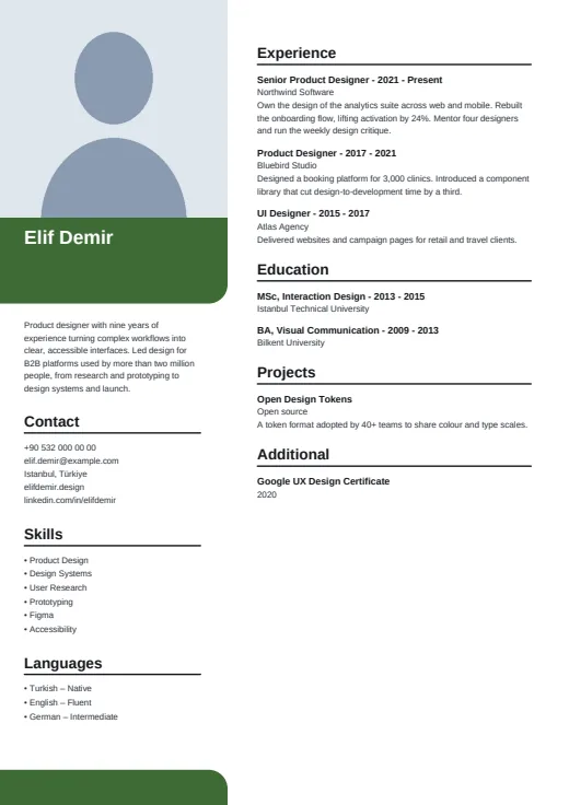 Portrait
A large corner photo leads the page, with your name on a colour block and calm, plain lists below.
Photo · Two columns · 5 colours
-
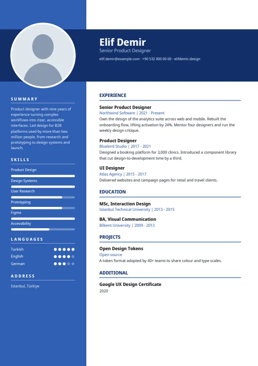 Crossbar
A full-colour side column, crossed near the top by a dark bar that carries your name and photo.
Photo · Two columns · 5 colours