
Plain ATS CV template
The plainest design in the set: one column of clean text, built for online application portals.
- Without a photo
- One column
- 4 colours
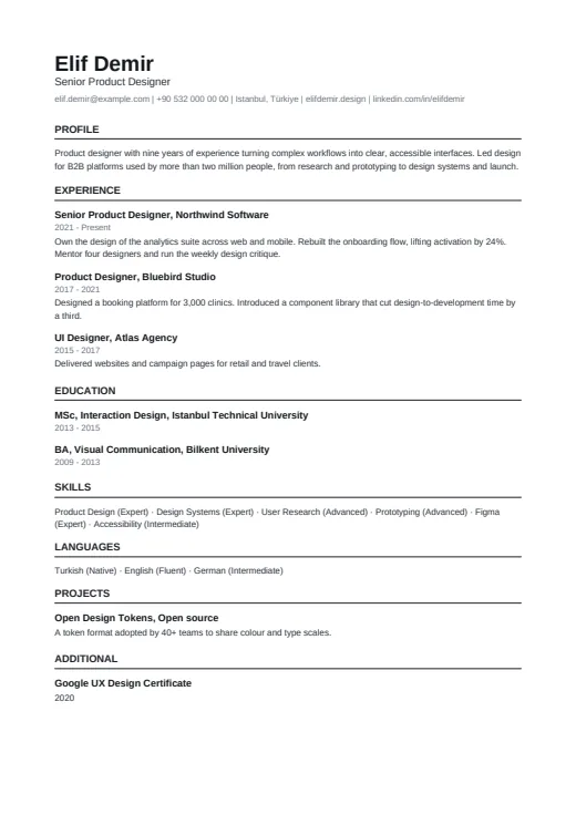
4 colours to choose from
The layout stays; only the colours change.
-
Black & White
-
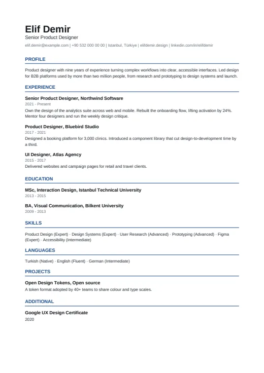 Navy
-
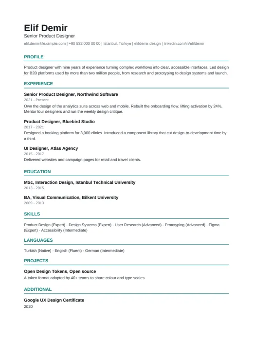 Teal
-
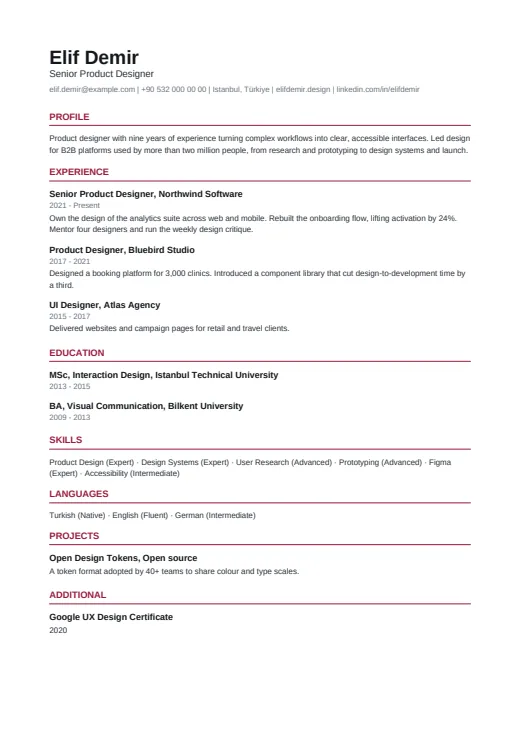 Burgundy
What sets it apart
-
Text and rules, nothing else
There are no icons, level bars, coloured blocks or layout tables. The only drawn lines are thin rules under the headings; the name, contact line, entries and levels are all plain text.
-
Title and employer together
Each entry opens with job title and company on one bold line, such as Product Designer, Bluebird Studio, with the years in grey below. People and software read the pair the same way.
-
Colour only on headings
The Black & White tone keeps the page black and grey. The other three tones colour only the section headings and their rules, while the name and body text stay black.
Who it suits
- Candidates applying through online portals, especially at large employers
- Anyone asked to upload a CV into an application form
- Job seekers who want a plain copy beside a designed version of their CV
How an ATS reads it
This is the most parser-friendly design in Twin CV: one column of real text with no icons, shapes, letter-spacing or layout tables, and levels written as words. That leaves little in the layout to misread. It cannot fix the content, though: clear job titles and the job ad's own words still count. The ATS score (Premium) audits the content, scores it out of 100 and lists concrete fixes.
Use this design
Build your CV, then choose Plain ATS in the design gallery.
Start in Quick CVQuick CV needs no account; the design gallery opens once you sign up. Every plan can preview every design, and the PDF download comes with Standard and Premium.
Questions about Plain ATS

What makes Plain ATS friendly to ATS software?
Everything a parser might stumble on is left out: one column, all real text, with no icons, shapes, layout tables or letter-spacing. Levels are words in brackets, not bars or dots, so the level is read with the name.
When is a designed CV a better choice than Plain ATS?
When a person reads it first: a CV sent by email, passed on through a referral or linked from your portfolio. There, a design such as Chrono gives the page more character. Your content stays the same, so you can switch whenever you like.
Can I add a photo to Plain ATS?
No, on purpose: a parser cannot read a photo, and applications in the UK or US, for example, usually go without one. If a job ad asks for a photo, pick a photo design such as Harbor or Portrait; the photo comes from your profile.
More designs
-
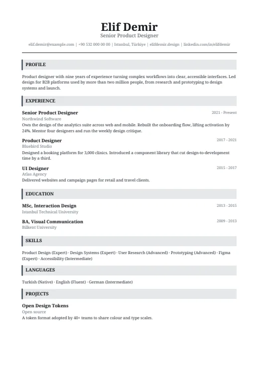 Headline
A classic serif CV in one column, with a centred name and grey bars that open each section.
No photo · One column · 5 colours
-
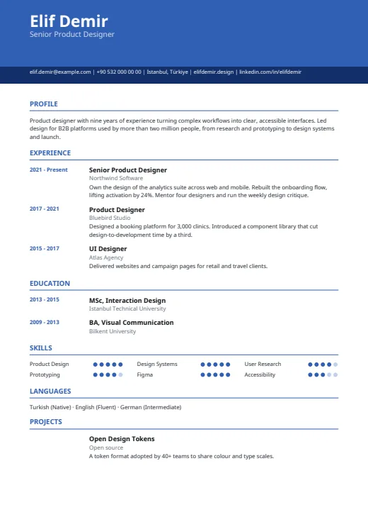 Chrono
One column under a colour header, with every date lined up in its own margin on the left.
No photo · One column · 5 colours
-
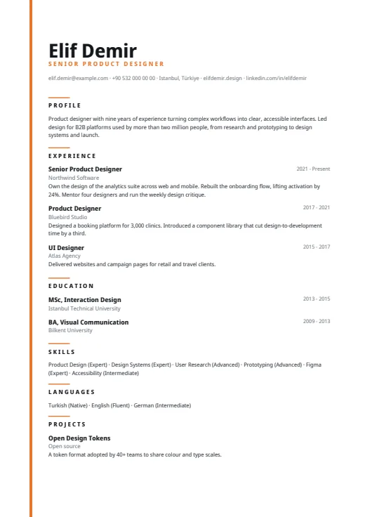 Lineage
A quiet one-column CV led by a very large name, with a thin colour line down the left edge.
No photo · One column · 5 colours