
Editorial CV template
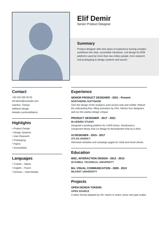
A quiet, print-style CV with an upright framed photo, a large name and a grey band for your summary.
- With a photo
- Two columns
- 5 colours
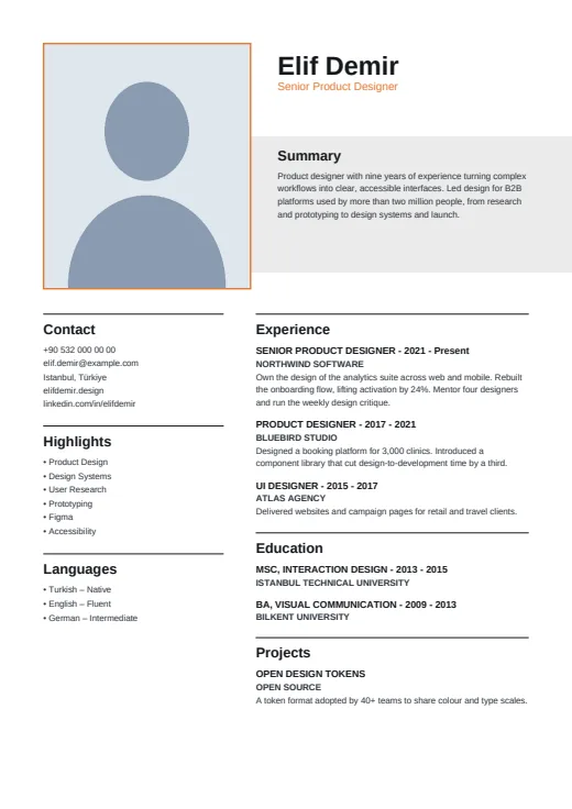
5 colours to choose from
The layout stays; only the colours change.
-
Tangerine
-
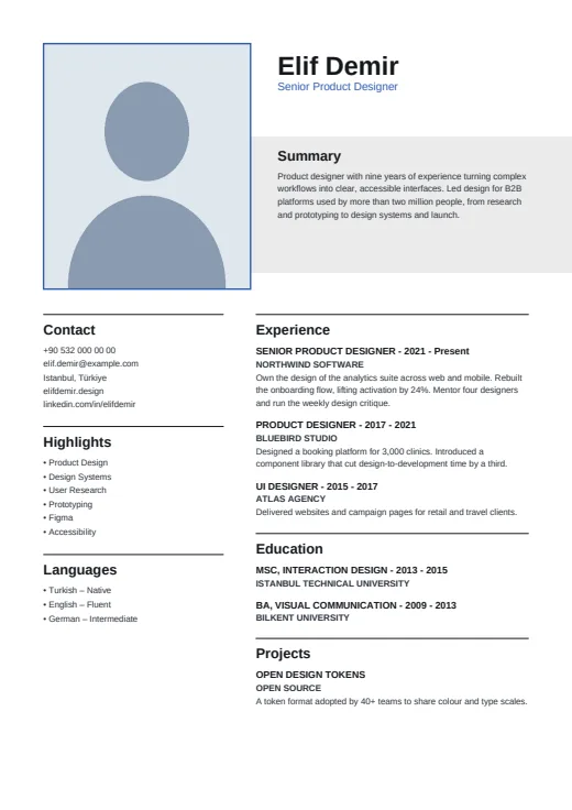 Royal Blue
-
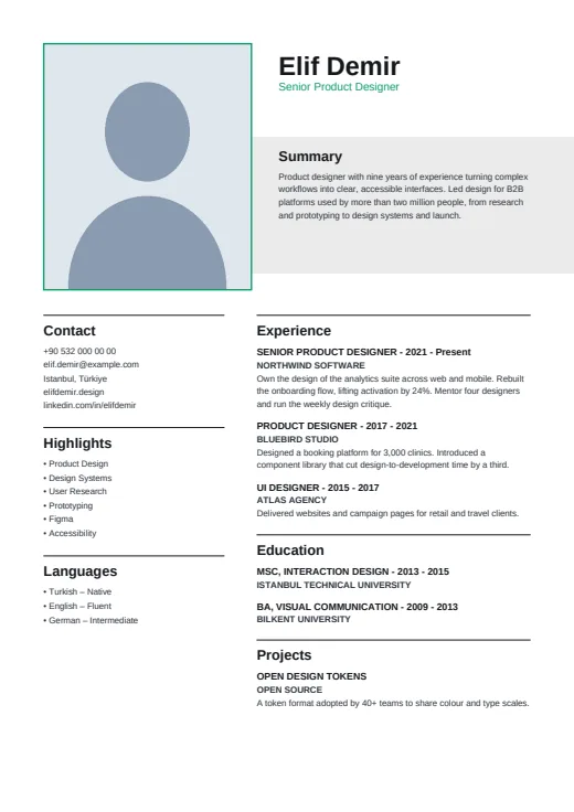 Emerald
-
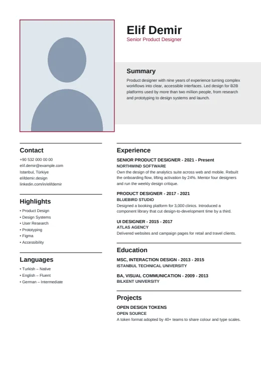 Burgundy
-
 Black & White
What sets it apart
-
Framed photo, big name
An upright photo in a thin colour frame opens the page. Beside it stands your name in large bold black type, with your job title in the accent colour just below.
-
Grey band for the summary
Your summary sits on a light grey band that starts beside the photo and runs off the right edge of the page, giving your opening lines a space of their own.
-
Rules above the headings
A thin black rule sits above each heading, not below it. Entries set the job title in capitals with the years, and the company in bold capitals underneath; your skills appear as Highlights.
Who it suits
- Experienced professionals whose work history should carry the page
- Law, finance, public-sector and academic applicants, in the Black & White tone
- Writers, editors and communications people who like a print-style look
How an ATS reads it
Editorial avoids the details that can confuse parsers: no letter-spacing, no level bars, no icons. Skills are plain bullets, languages carry their level as words, and every word is selectable, with the photo as the only picture. Page 1 does have two columns, and the side column is a separate frame that some parsers read out of order. From page 2 the text runs in one column. For an exacting online portal, Plain ATS is the safer upload.
Use this design
Build your CV, then choose Editorial in the design gallery.
Start in Quick CVQuick CV needs no account; the design gallery opens once you sign up. Every plan can preview every design, and the PDF download comes with Standard and Premium.
Questions about Editorial

How long can the summary be in Editorial?
The grey band has a fixed size, so longer text is set smaller to fit. Editorial looks best with a summary of a few lines. The band is painted even when the summary is empty, so a short one beats none.
Is there a conservative colour for Editorial?
Yes, the Black & White tone. The photo frame turns black and the job title grey, so the page carries no colour at all. It suits law, finance or the public sector, where a sober CV is often preferred.
What does page 2 of an Editorial CV look like?
From page 2 the layout becomes one full-width column. The rest of your experience, education and projects runs across the page with the same headings and rules, while contact details and Highlights stay on page 1.
More designs
-
 Portrait
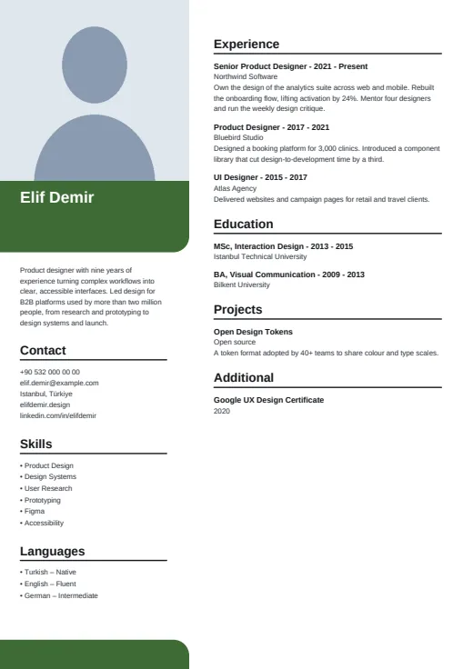
A large corner photo leads the page, with your name on a colour block and calm, plain lists below.
Photo · Two columns · 5 colours
-
 Leaf
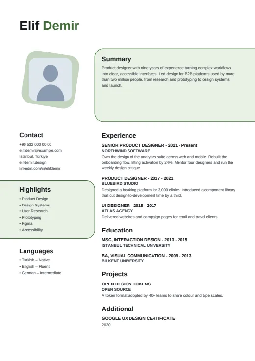
A warm two-column CV with soft rounded panels and a photo on a slightly tilted colour tile.
Photo · Two columns · 5 colours
-
 Boxed
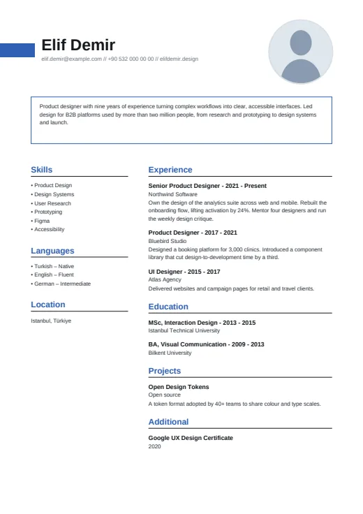
Your summary gets its own thin outlined box, under a bold name and a small round photo.
Photo · Two columns · 5 colours