
Headline CV template
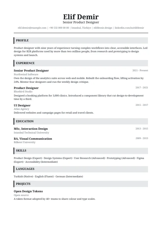
A classic serif CV in one column, with a centred name and grey bars that open each section.
- Without a photo
- One column
- 5 colours
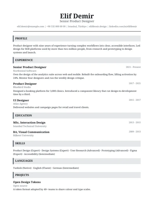
5 colours to choose from
The layout stays; only the colours change.
-
Graphite
-
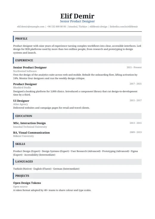 Navy
-
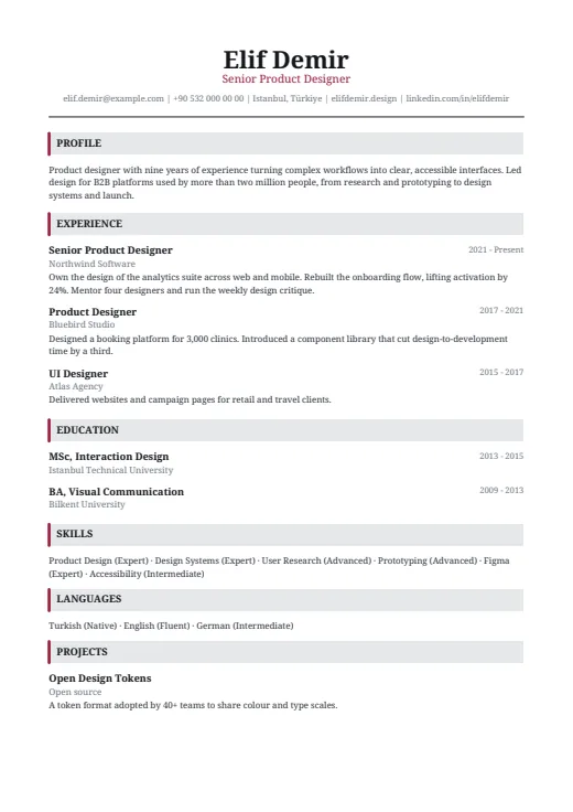 Burgundy
-
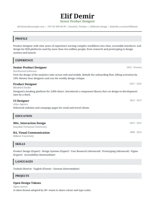 Forest
-
 Black & White
What sets it apart
-
Serif from top to bottom
The whole CV is set in Noto Serif, a book-style typeface with small finishing strokes on the letters. It covers Turkish characters, and you can pick another font for this design if you prefer.
-
A centred header
Name, job title and contact line are centred at the top of page 1, above a rule across the page. The job title, from your latest position, takes the accent colour; the contact line is grey.
-
Grey bars for headings
Each section opens with a full-width light grey bar with a thick accent edge on the left. Entries below stay simple: bold job title, employer underneath, years on the right.
Who it suits
- Candidates in law, finance, academia or the public sector
- Experienced professionals whose CV runs to two pages or more
- Anyone after a formal page with no columns, icons or photo
How an ATS reads it
Headline gives a parser little to trip over. It reads in one column, with no photo and no letter-spacing, and writes skill and language levels as words, such as Figma (Expert). The grey bars are shapes drawn behind the headings; the heading words stay ordinary, selectable text. For the barest version of your CV on a strict online portal, Plain ATS drops the bars and the serif too.
Use this design
Build your CV, then choose Headline in the design gallery.
Start in Quick CVQuick CV needs no account; the design gallery opens once you sign up. Every plan can preview every design, and the PDF download comes with Standard and Premium.
Questions about Headline

Is Headline a good fit for law, finance or academia?
Often, yes. Those fields, and much of the public sector, tend to favour a traditional page: serif type, a centred name, no photo, no graphics. Headline adds one restrained accent colour; Graphite, Navy and Black & White are the quietest tones.
How is Headline different from Plain ATS?
Both are one column, with no photo and levels as text. Headline adds a serif typeface, a centred header and grey heading bars with an accent edge. Plain ATS is left-aligned sans-serif with thin rules under the headings, nothing more. Your content is the same, so you can switch any time.
Does Headline work for a two-page CV?
Yes. In one column, your experience simply continues on page 2 with the same headings and spacing; page numbers start there. No side column is left half empty, which makes Headline an easy fit for a long career.
More designs
-
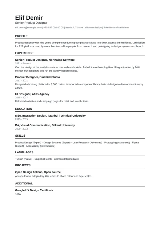 Plain ATS
The plainest design in the set: one column of clean text, built for online application portals.
No photo · One column · 4 colours
-
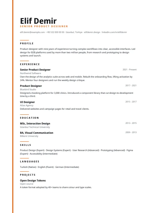 Lineage
A quiet one-column CV led by a very large name, with a thin colour line down the left edge.
No photo · One column · 5 colours
-
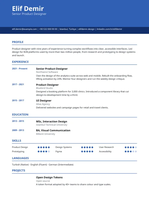 Chrono
One column under a colour header, with every date lined up in its own margin on the left.
No photo · One column · 5 colours